A small town pickle brand serves customers in Germany & locally
ABOUT THE BRAND
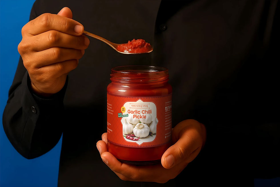
Tikumaa's pickles
Tikumaa's is a Kathiyawadi food brand offering high-quality condiments and snacks. It originated when Tiku Ben, a homemaker, mother, and wife, started making pickles for friends and family by combining her mother's and mother-in-law's traditional Kathiyawadi recipes.


TLDR
Gap : Market is saturated with pickle brands that claim authentic taste. But they either fail to deliver or are priced at a premium. This leaves space for a brand that delivers good quality and authentic taste without charging a premium.
Insight : Masses buy things not because they're great, but because they're not bad. They settle for the safest option that's not too expensive and still looks reasonably trustworthy.
Solution : Create a brand that feels reasonably priced and trusted without getting lost in the plethora of brands.Avocado toast with chaat masala?
Chaakli dipped in schezwan sauce?
Achaari pizza? or Khausaa?
If yes, then you’re a true Indian.
We Indians possess the unique skill of being global and local at the same time.
Food trends change, but taste remains. Modern life leaves little time for traditional cooking, but we crave those familiar tastes.
We celebrate new ideas, cultures and dishes, but without giving up on being true “Kathiyawadi”.
How we do it?
We make pickles & papad, but Kathiyawadi.
We also make spreads & dips, but Kathiyawadi.
Considering that the brand has an international target audience as well as within India, the brand needs to feel authentic and modern at the same time. Here's how we did it :
Innovate for modern life in sync with authentic karhiyawadi taste and culture.
Think of it like this : What's stopping you from trying a mango pickle with your nachos instead of salsa? NOTHING.
Designing the logo was fairly simple. Keeping in mind that the brand feel has to be nostalgic without feeling too premium, we integrated the letter "T" from english with the 'T" from gujarati to form a mix of Indian and western, modern and traditional mix.
Our goal with this reaearch is to find authentic Kathiwadi art references, and use them as our inspiration to develop Tikumaa’s visual identity.
We saw :
-
Consistent use of repetition of designs and motifs.
-
Squares and rectangles
-
Use of Red and white with high contrast vibrant colors.
-
Case study

Problem & Solution
Gap : Market is saturated with pickle brands that claim authentic taste. But they either fail to deliver or are priced at a premium. This leaves space for a brand that delivers good quality and authentic taste without charging a premium.
Insight : Masses buy things not because they're great, but because they're not bad. They settle for the safest option that's not too expensive and still looks reasonably trustworthy.
Solution : Create a brand that feels reasonably priced and trusted without getting lost in the plethora of brands.

Thought process
Avocado toast with chaat masala?
Chaakli dipped in schezwan sauce?
Achaari pizza? or Khausaa?
If yes, then you’re a true Indian.
We Indians possess the unique skill of being global and local at the same time.
Food trends change, but taste remains. Modern life leaves little time for traditional cooking, but we crave those familiar tastes.

Positioning & Strategy
We celebrate new ideas, cultures and dishes, but without giving up on being true “Kathiyawadi”.
How we do it?
We make pickles & papad, but Kathiyawadi.
We also make spreads & dips, but Kathiyawadi.

Articulating the brand
Considering that the brand has an international target audience as well as within India, the brand needs to feel authentic and modern at the same time. Here's how we did it :
Innovate for modern life in sync with authentic karhiyawadi taste and culture.
Think of it like this : What's stopping you from trying a mango pickle with your nachos instead of salsa? NOTHING.

Logo design
Designing the logo was fairly simple. Keeping in mind that the brand feel has to be nostalgic without feeling too premium, we integrated the letter "T" from english with the 'T" from gujarati to form a mix of Indian and western, modern and traditional mix.

Packaging design
Our goal with this reaearch is to find authentic Kathiwadi art references, and use them as our inspiration to develop Tikumaa’s visual identity.
We saw :
-
Consistent use of repetition of designs and motifs.
-
Squares and rectangles
-
Use of Red and white with high contrast vibrant colors.


IMPACT CREATED
Consistent and efficient brand decisions
Brand clarity that allowed more efficient decisions about business and product
750 kg more pickles sold than previous years
Improvement in customer experience and trust. Customers nowbelieve in the brand & are more involved
New products are better fit for the audience
An improved design process with thoughtful designs resulted in greater product design
Efficient and unified brand messaging
A unified message on all channels allowed for a stronger and clearer communication


